And here's the little comp:
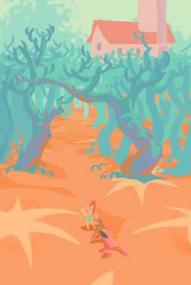
There's a bit of a difference in the colors between the two, I had to make the ground lighter in the final because it printed too darkly.
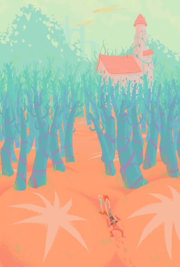
For this image, I wanted to use really off colors, like salmon, teal, cyan, magenta, light toothpaste green etc (which is now my favorite color). The colors still work together because salmon is close to red, and teal/cyan is close to green. But both colors are also close to orange and blue, so it's like a... tertiary compliment? The colors are still compliments, just not primary or secondary.
The sand is salmon colored because I got sick of the gold/yellow-ish colored sand, and I had already used that in Seedling, didn't want to be repetitive.
With that established, what works with salmon? I wanted the trees to be a cooler color, so it's around the blue-green area and that works as a compliment. The sky is actually a really light green, because blue skies get boring. This'll probably mean the shadows are a bit greenish, but then this planet has like 2-3 suns, so light is being bounced everywhere. Which might just mean all the colors would get mussed up with all the reflective light, but that's not really the case because there's some atmospheric dust in the air to calm things down, you can kind of see it in the middle ground/background.
The print-out was almost fluorescent, which is neat.
I thought I'd start explaining how I get my colors since a few people expressed interest in that. I usually start with one color, like the salmon colored sand (we're talking invented color here, of course), and then things go from there. Uh, more on my next post, which should be my Drawing Concepts hw.