Monday, December 18, 2006
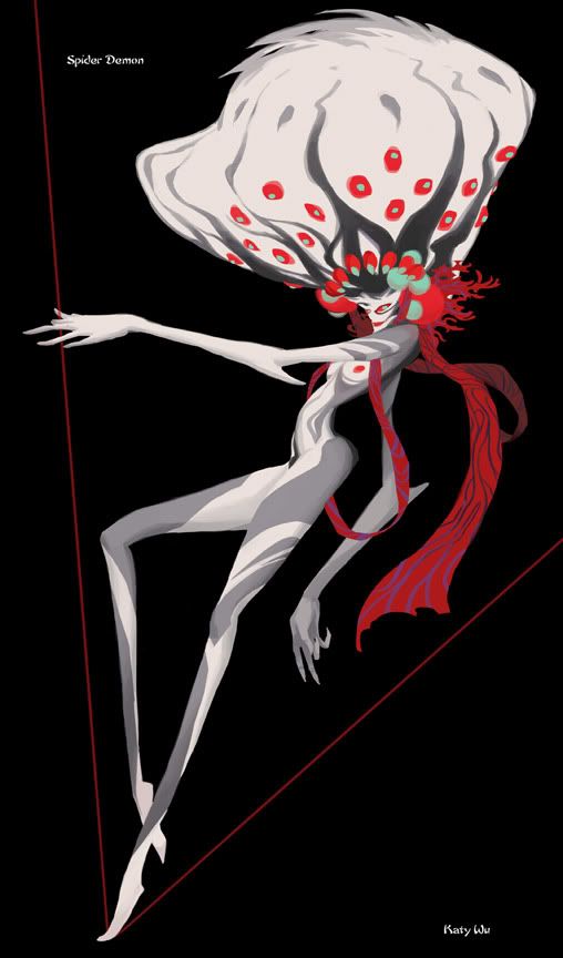
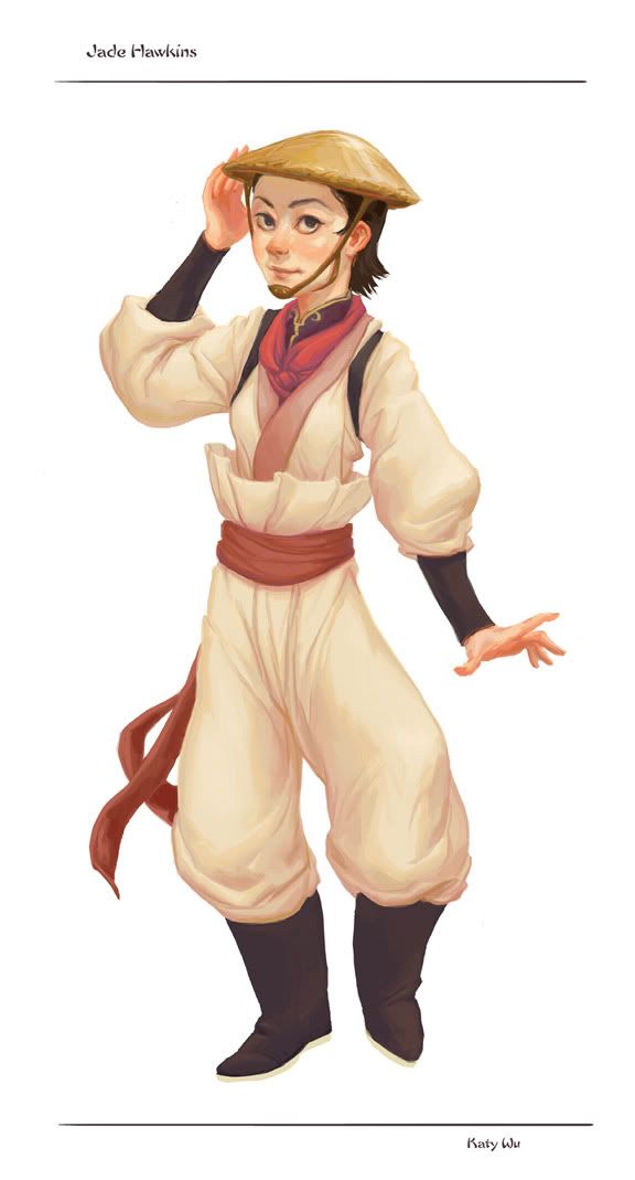
Character Designs
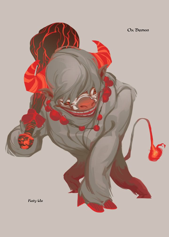
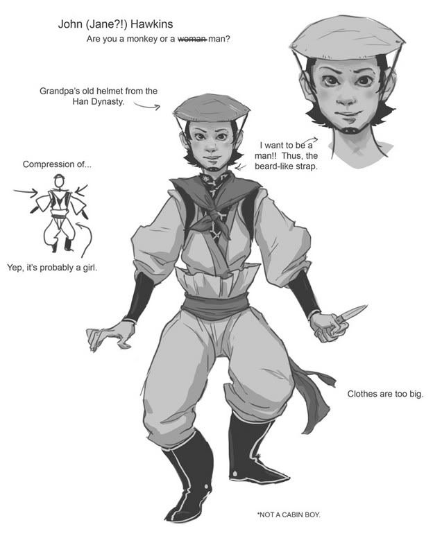
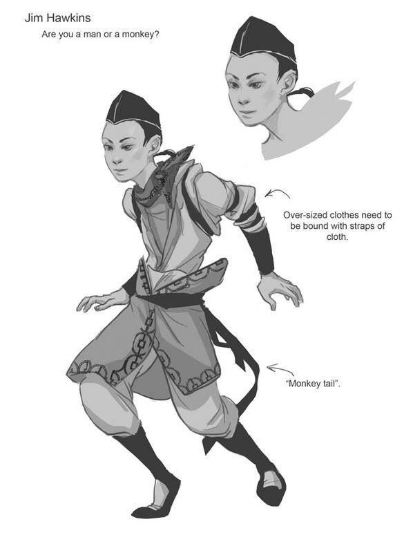
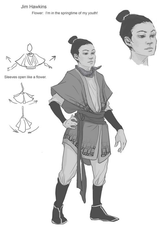
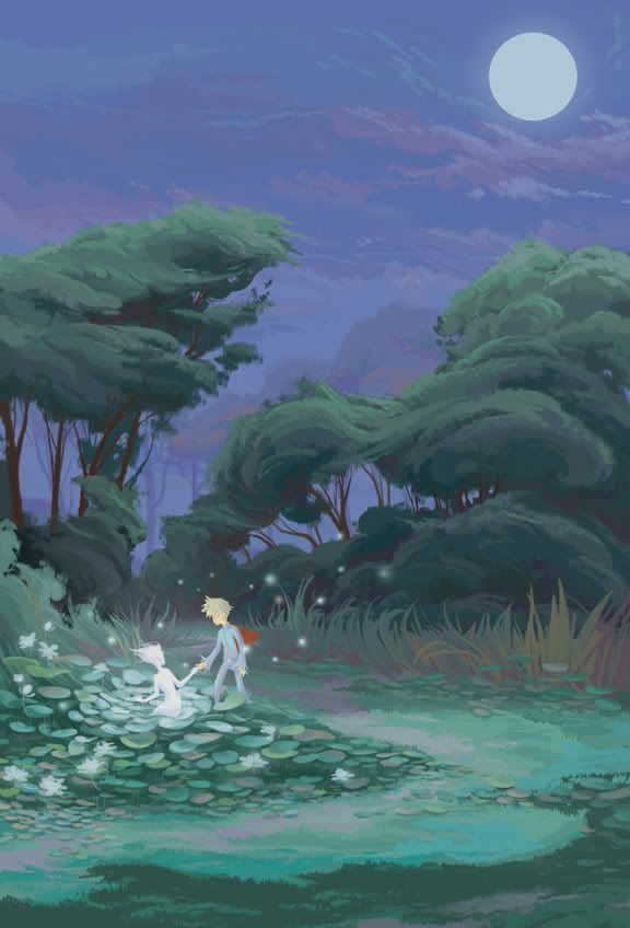
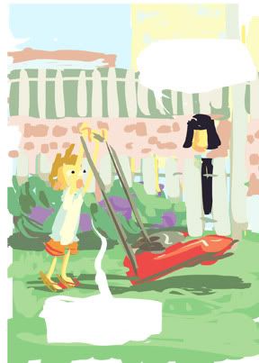
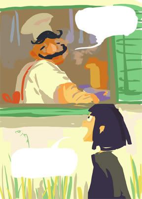
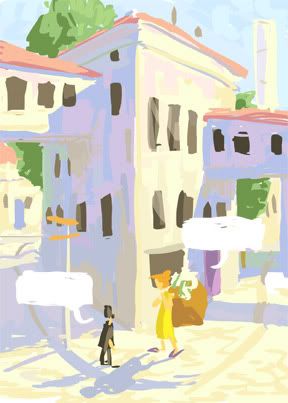
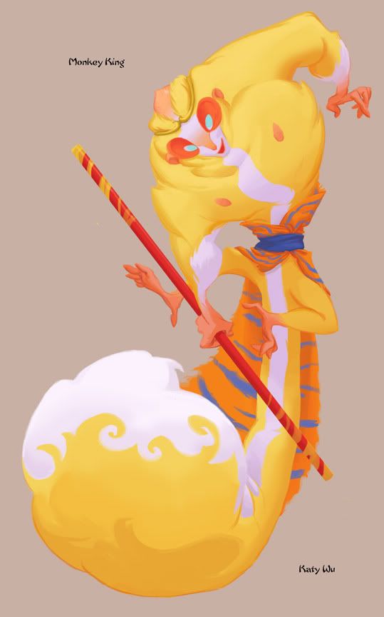
These are the designs for the last character design project, based on "Journey to the West". Yaay it's finally break~
Monday, December 11, 2006
Colored storyboards
Sunday, November 05, 2006
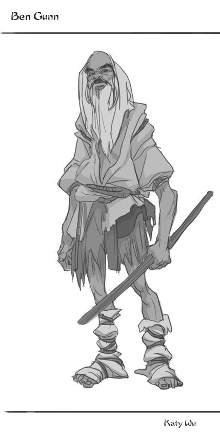
Here's the Ben Gunn design from Character Design 1:
I won't be posting the Captain Smollett design because that one needs some serious tweaking.
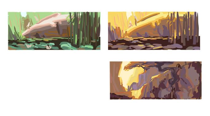
And what I'm working on in Visual Development, I've already blocked in a b/w version of these. Now I'm figuring out the colors:
I came up with 2 moods for the first painting and decided to keep the second more golden color comp for my second painting.
Monday, October 23, 2006
Finished Character Designs
The first character design 1 project is over! The are the final character designs for my ancient China themed Treasure Island.
Our next project is "Journey to the West". ...and I just did China! Oh well, at least I have a lot of research already, my characters are based on China in 700 AD, which is the approximate time "Journey to the West" took place!
Sunday, October 15, 2006
Monday, October 02, 2006
Some old oil paintings
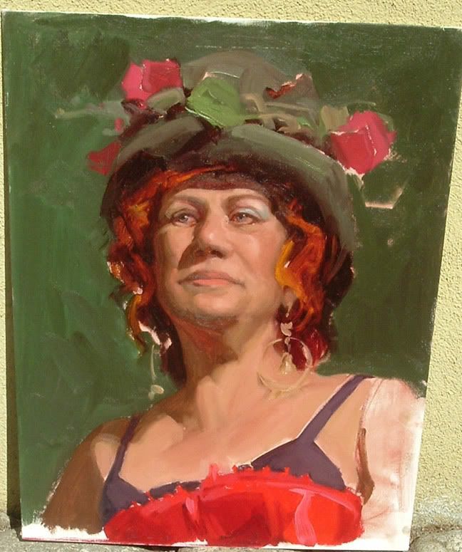
I finally got some good photos of some of my favorite oil paintings. Some of them are pretty old, like this was from 2nd term when I was in Mike Hussar's head painting class. Good times.
This was my best painting I did that term because it was the only set up that was ridiculously colorful (I think it was one of Charle's setups). All of Mike's setups were desaturated with gray backgrounds, and I learned to paint with a pretty desaturated palette. It helped in the long run though, it's easier to see subtle color shifts now.
The other 3 paintings (in the illustration gallery under traditional work) are from sometime in 3rd term. And then I kind of painted less and less because I became busier with scholarship work. I'd love to go back to the workshops but this term is proving to be super crazy.
Character Designs
From Kevin and Hong's character design 1 class. We're doing Treasure Island as a periodical piece. So mine takes place in China during the Tang Dynasty (800's).
Last week we had to draw 3 drawings of Long John Silver and 3 of Jim Hawkins. And yes, they are in gray scale. Sacriligeous! I could've used value more strongly in my designs, but everything is kind of mid-value because most colors I use are in the mid-value range. I find I dislike working in strictly black and white.
I came up with a theme for each of the characters, I need to work on presenting that though.
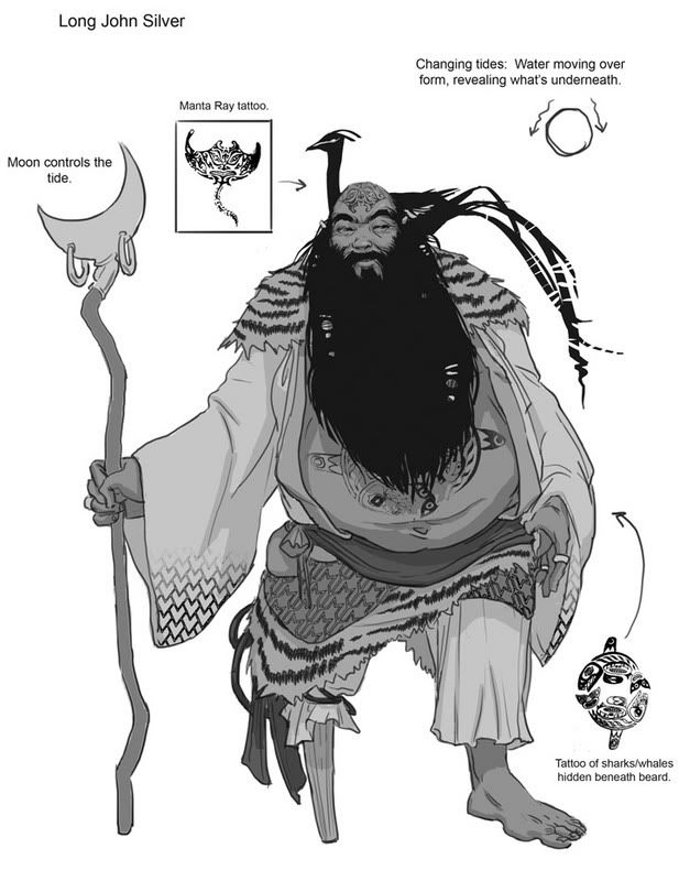
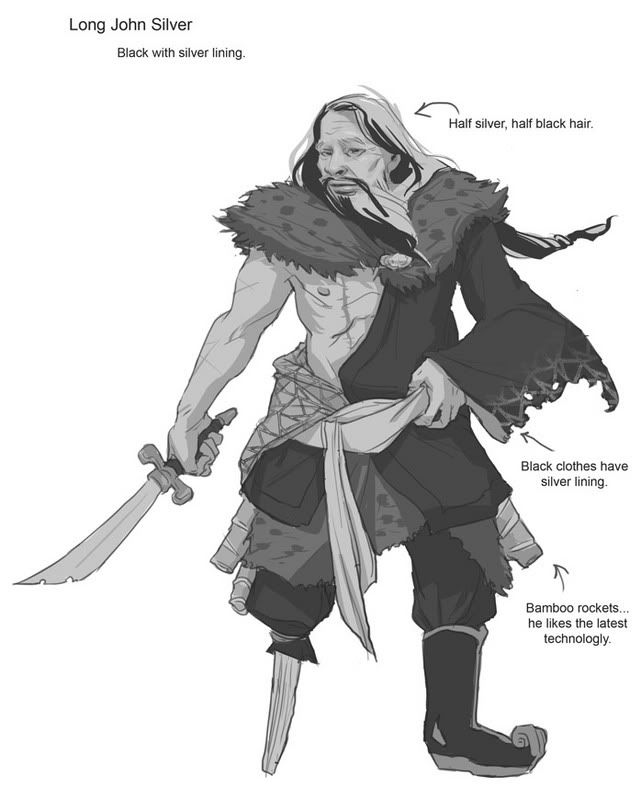
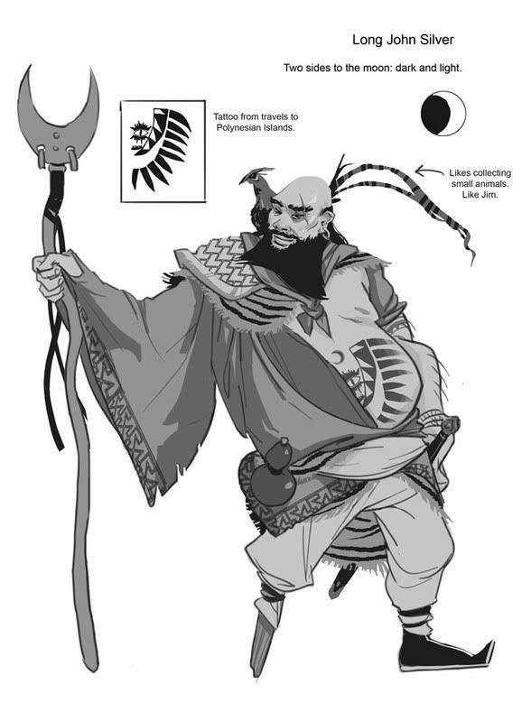
Here's Long John(s):
This was the favorite:
Although people liked this one a lot too, I'm going to combine some stuff from both of them:
And this is the first Long John I drew:
On Long John, I worked on pushing the two-sided nature of his personality. So I used things like the moon, tides, and yin-yang to describe that.
3 Jim Hawkins:
I originally intended Jim to be a boy, but this guy turned out looking girly, so I pushed that.
I like this guy's face, but other then that he's kind of boring.
I like how this Jim's clothes is different from the others:
Since Jim is the main character, he's the most boring guy. So I tried to make him into a more intersting guy, like a monkey! The flower one is kind of gay but I still like the sleeves.
Thursday, September 21, 2006
Monday, September 11, 2006
Rough color comps
Tuesday, August 29, 2006
Thursday, August 17, 2006
Preview for the Flight comic
Went more painterly with this one:
I'm not very happy with the way the lilypad leaves came out, the colors there got pretty desaturated because I used a brush that wasn't completely flat and colors started to mix and gray out. I might redo this with a more simple and graphic appearance, but I want to keep some painterly elements too.
...I'm finished with all of my finals!
Wednesday, August 09, 2006
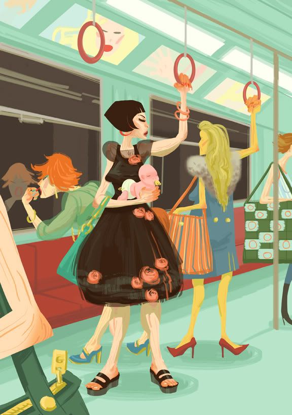
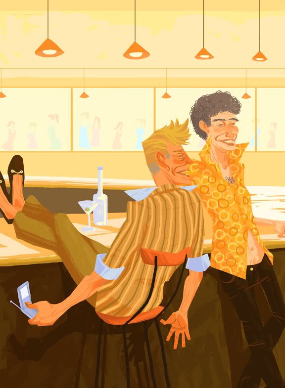
The last of the lifestyles series from drawing concepts 2, old models living out the rest of their lives. Or something like that. Babies are now optional accessories.
I like the colors on this one more then the last one. The colors on the last one were very tame, orange/yellow/blue. Here, I started out with red and green as my main compliments, but eventually branched out to orange and blue as my sub compliments, and somewhere between all that some yellow slipped in as well. I think what makes this piece work is most of the reds and oranges are very saturated and warm, while most of the blues and greens are desaturated and more neutral temperature-wise.
The color of the month is toothpaste green (seen in the bg here). I find it works real well with most reds, or most colors that have some red in them. And my printer actually prints this shade!
Wednesday, July 26, 2006
Drawing Concepts 2 HW
For the lifestyle final, "old models living out the rest of their lives".
Tried out some new brushes on this one.
I originally intended the colors to look like this:
But my printer couldn't hit those rich golds so I had to push the red-oranges and ended up using the colors from this modified comp:
I think everything worked pretty well in the end.
Tried out some new brushes on this one.
I originally intended the colors to look like this:
But my printer couldn't hit those rich golds so I had to push the red-oranges and ended up using the colors from this modified comp:
I think everything worked pretty well in the end.
Monday, July 24, 2006
More traditional work
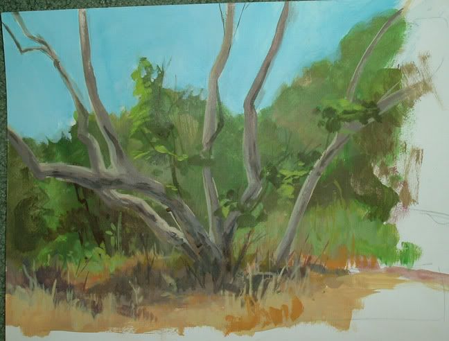
I uploaded some more gouache paintings I did from last term. Most of the landscapes were done last fall or summer, the figures are from last term.
This landscape was done last Friday with acrylics at Eaton Canyon:
I'm still pretty rusty all around, but I want to continue landscape painting at least once a week (if I can find people to drag along).
As for the colors, they weren't captured very well because of my ancient digital camera. ...They'll probably all need to be re-shot once I get a better camera, a lot of the blues and purples were grayed out.
As for this landscape, I noticed I was playing it a bit too safe and sticking to pretty tame greens, oranges, yellows, blues, and purples. Next time, I hope to add more tertiary colors like magenta, which I remember seeing in the shadow of the tree. The value of the cast shadows is too dark as well...
Friday, July 21, 2006
Contrary to popular belief...
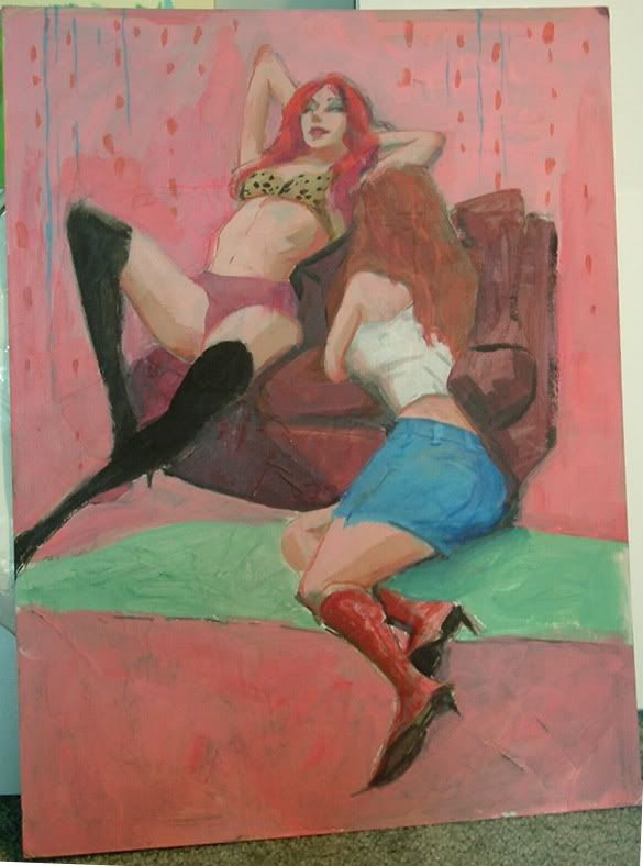
Yes, I still do paint. With REAL PAINT:
This is an in-class painting I did in David Luce's Drawing Concepts 2 class. Good class.
Done in acrylics over newspaper collage on illustration board.
I think I should be more bold with the electric blue stripes in the background, thicker stripes. As for the colors, everything is actually pretty accurate, I think. (Except for the cheap colored skin...) There was a bright pink background and the pad on the floor was a nice neon green. The couch was more of an orange kind of brown, and I pushed it more towards a maroon. So in the end the picture is mostly reds and greens, with hints of orangey reds and some electric blue.
I also uploaded a couple of old gouache landscape paintings from last summer/fall in the illustration gallery, under the "traditional work" folder. I'll upload some more recent ones, I have about 3 wc sketchbooks full of landscape paintings, and even some figures in gouache. I also uploaded an old photo of my first scholarship setup from 3rd term. Only half of the work is visible though.
And awful photographs like this remind me that I really, really need a new digital camera.
Friday, July 14, 2006
Digital Illust. Painting hw
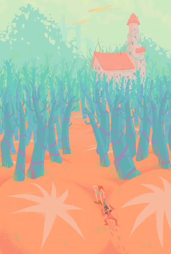
So here's the finished product:
And here's the little comp:
There's a bit of a difference in the colors between the two, I had to make the ground lighter in the final because it printed too darkly.
For this image, I wanted to use really off colors, like salmon, teal, cyan, magenta, light toothpaste green etc (which is now my favorite color). The colors still work together because salmon is close to red, and teal/cyan is close to green. But both colors are also close to orange and blue, so it's like a... tertiary compliment? The colors are still compliments, just not primary or secondary.
The sand is salmon colored because I got sick of the gold/yellow-ish colored sand, and I had already used that in Seedling, didn't want to be repetitive.
With that established, what works with salmon? I wanted the trees to be a cooler color, so it's around the blue-green area and that works as a compliment. The sky is actually a really light green, because blue skies get boring. This'll probably mean the shadows are a bit greenish, but then this planet has like 2-3 suns, so light is being bounced everywhere. Which might just mean all the colors would get mussed up with all the reflective light, but that's not really the case because there's some atmospheric dust in the air to calm things down, you can kind of see it in the middle ground/background.
The print-out was almost fluorescent, which is neat.
I thought I'd start explaining how I get my colors since a few people expressed interest in that. I usually start with one color, like the salmon colored sand (we're talking invented color here, of course), and then things go from there. Uh, more on my next post, which should be my Drawing Concepts hw.
Sunday, July 02, 2006
The gigantic scholarship update
Yeah, so after the last post, I finished up the 3 comps I posted and I did 3 more images. The comic was bound, the sculpture finished and painted. Too bad I forgot to take a picture of the entire setup! So the entire show consisted of 8 poster images of varying size, 1 new book, and a sculpture. Nearly 2.5 times more work then last term (last term's comic panels don't count, I just needed those to fill up wall space!)
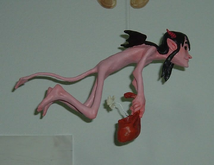
So without further ado, the sculpture, painted. It now hangs in my room, since I can't just leave it lying around somewhere, it's kind of delicate. Transporting it to the Wind Tunnel was a pain in the ass, especially with the sweltering weather. Hot weather = soft sculpy. It was... bendy. But now it's okay.
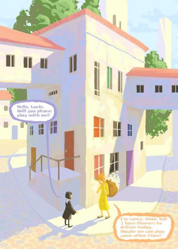
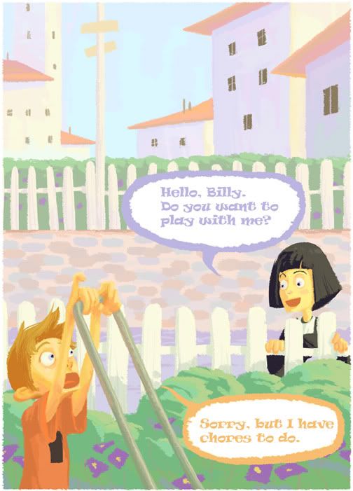
I also started up the Sultan Stan series of images. It's a children's story I wrote in Children's Lit, I think two terms ago. The story is still incomplete and already 4 chapters! I'm going to have to finish it before next term's scholarship, since I want to illustrate it as a children's comic/book.
And never before posted:
The double page spread, whoo. And just to clear things up, Stan is a BOY. ...with
a gay haircut. I think he looks cute, so nyeah! ...he's wearing a TUNIC.
Some sneak peak images I did for the Flight comic. Probably the only public stuff I'll post of it until it's (hopefully) finished and published. New style, new story, new everything. I did these Tuesday night, before I finally finished setting up.
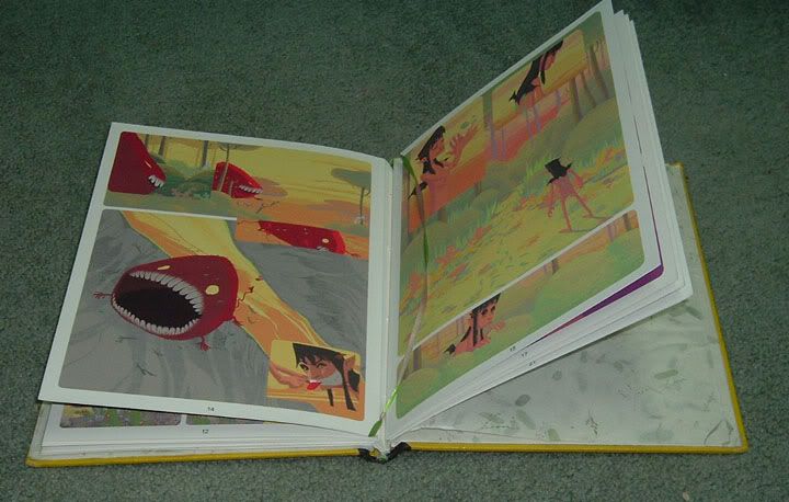
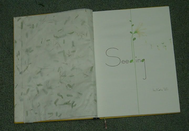
And lastly, the finished, bound comic book. Titled Seedling.
I think I did an okay job on the binding, things got a little loose in some places but the book holds together just fine. My first hardcover! The second chapter, Strangeling, is being planned and will probably be out next scholarship along with the Sultan Stan children's book, and the Flight comic. Although my priorities go like this: Flight comic, Sultan Stan, Strangeling, and Red Rose (secret!).
And for the record, katywu.com should be up in uh... after I do some proper post-scholarship-crashing-catching-up-on-hw-and-sleeping. Give me a week or so.
So without further ado, the sculpture, painted. It now hangs in my room, since I can't just leave it lying around somewhere, it's kind of delicate. Transporting it to the Wind Tunnel was a pain in the ass, especially with the sweltering weather. Hot weather = soft sculpy. It was... bendy. But now it's okay.
I also started up the Sultan Stan series of images. It's a children's story I wrote in Children's Lit, I think two terms ago. The story is still incomplete and already 4 chapters! I'm going to have to finish it before next term's scholarship, since I want to illustrate it as a children's comic/book.
And never before posted:
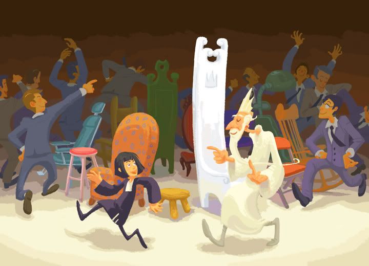
The double page spread, whoo. And just to clear things up, Stan is a BOY. ...with
a gay haircut. I think he looks cute, so nyeah! ...he's wearing a TUNIC.
Some sneak peak images I did for the Flight comic. Probably the only public stuff I'll post of it until it's (hopefully) finished and published. New style, new story, new everything. I did these Tuesday night, before I finally finished setting up.
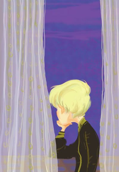
And lastly, the finished, bound comic book. Titled Seedling.
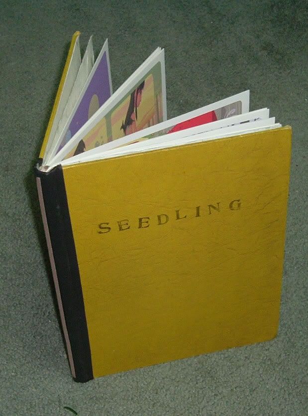
I think I did an okay job on the binding, things got a little loose in some places but the book holds together just fine. My first hardcover! The second chapter, Strangeling, is being planned and will probably be out next scholarship along with the Sultan Stan children's book, and the Flight comic. Although my priorities go like this: Flight comic, Sultan Stan, Strangeling, and Red Rose (secret!).
And for the record, katywu.com should be up in uh... after I do some proper post-scholarship-crashing-catching-up-on-hw-and-sleeping. Give me a week or so.
Sunday, June 18, 2006
New illustrations
Illustration Gallery up
Link is on the right!
And I'm going to get my homepage set up sometime after scholarship (which is on the 26th!!!)
And some quick color comps:
...gay baker.
I'm not really happy with the colors one the first comp, but I'll probably do the second comp first since I feel most confident about it. And then I want to do a good job on the third comp.
Everything needs to be pretty white, because all the buildings are described as white/pearl in this story, which means I just have to get creative with the coloring.
I need to start these soon and finish them FAST. That seems to be the ongoing theme when scholarship deadline is closing in.
Subscribe to:
Posts (Atom)